useAutocomplete
The useAutocomplete hook is used to get data from the API and to manage the Material UI <Autocomplete> component.
Usage with React Hook Form (@pankod/refine-react-hook-form)
We'll demonstrate how to get data at /categories endpoint from https://api.fake-rest.refine.dev REST API.
{
    [
        {
            id: 1,
            title: "E-business",
        },
        {
            id: 2,
            title: "Virtual Invoice Avon",
        },
        {
            id: 3,
            title: "Unbranded",
        },
    ]
}
import { HttpError } from "@pankod/refine-core";
import {
    Create,
    Box,
    Autocomplete,
    useAutocomplete,
    TextField,
} from "@pankod/refine-mui";
import { useForm, Controller } from "@pankod/refine-react-hook-form";

export const PostCreate = () => {
    const {
        saveButtonProps,
        refineCore: { formLoading, queryResult },
        register,
        control,
        formState: { errors },
    } = useForm<IPost, HttpError, IPost & { category: ICategory }>();

    const { autocompleteProps } = useAutocomplete<ICategory>({
        resource: "categories",
    });

    return (
        <Create isLoading={formLoading} saveButtonProps={saveButtonProps}>
            <Box component="form">
                <Controller
                    control={control}
                    name="category"
                    rules={{ required: "This field is required" }}
                    render={({ field }) => (
                        <Autocomplete
                            {...autocompleteProps}
                            {...field}
                            onChange={(_, value) => {
                                field.onChange(value);
                            }}
                            getOptionLabel={(item) => {
                                return (
                                    autocompleteProps?.options?.find(
                                        (p) =>
                                            p?.id?.toString() ===
                                            item?.id?.toString(),
                                    )?.title ?? ""
                                );
                            }}
                            isOptionEqualToValue={(option, value) =>
                                value === undefined ||
                                option.id.toString() === value.toString()
                            }
                            renderInput={(params) => (
                                <TextField
                                    {...params}
                                    label="Category"
                                    margin="normal"
                                    variant="outlined"
                                    error={!!errors.category}
                                    helperText={errors.category?.message}
                                    required
                                />
                            )}
                        />
                    )}
                />
            </Box>
        </Create>
    );
};

interface ICategory {
    id: number;
    title: string;
}

export interface IPost {
    id: number;
    category: { id: number };
}
The use of useAutocomplete with useForm is demonstrated in the code above. You can use the useAutocomplete hook independently of the useFormhook.
Options
resource
const { autocompleteProps } = useAutocomplete({
    resource: "categories",
});
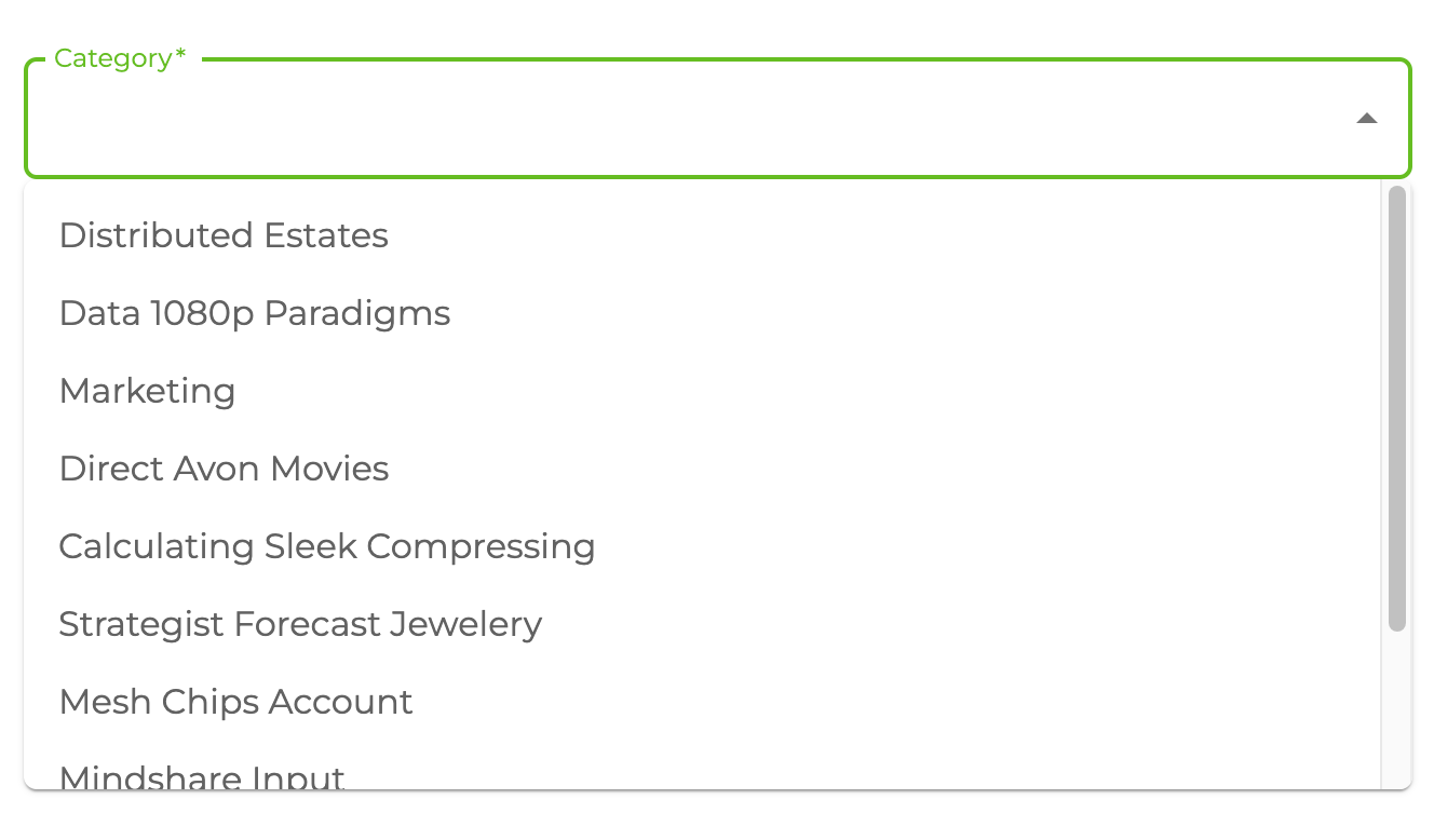
resource property determines API resource endpoint to fetch records from dataProvider. It returns properly configured options values for <Autocomplete> options.
Refer to Material UI Autocomplete component documentation for detailed info for options. →
defaultValue
const { autocompleteProps } = useAutocomplete({
    resource: "categories",
    defaultValue: "1",
});
Adds extra options to <Autocomplete> component. It uses useMany so defaultValue can be an array of strings like follows.
defaultValue: ["1", "2"],
Refer to the useMany documentation for detailed usage. →
Can use defaultValue property when edit a record in <Edit> component.
filters
const { autocompleteProps } = useAutocomplete({
    resource: "categories",
    filters: [
        {
            field: "isActive",
            operator: "eq",
            value: true,
        },
    ],
});
It allows us to add some filters while fetching the data. For example, if you want to list only the active records.
sort
const { autocompleteProps } = useAutocomplete({
    resource: "categories",
    sort: [
        {
            field: "title",
            order: "asc",
        },
    ],
});
It allows us to sort the options. For example, if you want to sort your list according to title by ascending.
fetchSize
const { autocompleteProps } = useAutocomplete({
    resource: "categories",
    fetchSize: 20,
});
Amount of records to fetch in the select box.
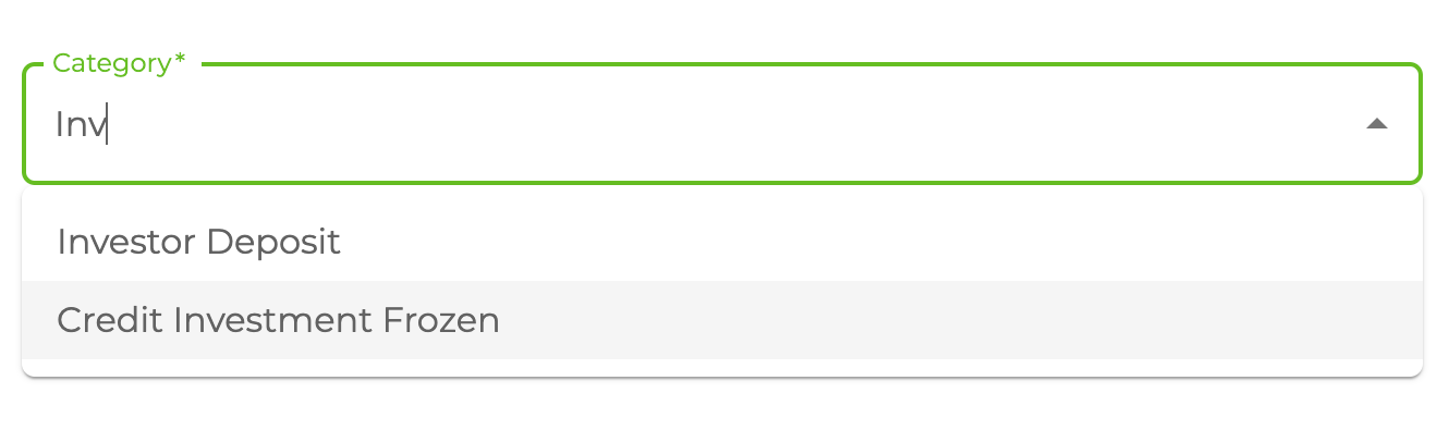
onSearch
const { autocompleteProps } = useAutocomplete({
    resource: "categories",
    onSearch: (value) => [
        {
            field: "title",
            operator: "containss",
            value,
        },
    ],
});
If defined, it allows us to override the filters to use when fetching the list of records. Thus, it. It should return CrudFilters.
queryOptions
const { autocompleteProps } = useAutocomplete({
    resource: "categories",
    queryOptions: {
        onError: () => {
            console.log("triggers when on query return Error");
        },
    },
});
useQuery options can be set by passing queryOptions property.
defaultValueQueryOptions
When the defaultValue property is given, the useMany data hook is called for the selected records. With this property, you can change the options of this query. If not given, the values given in queryOptions will be used.
const { autocompleteProps } = useAutocomplete({
    resource: "categories",
    defaultValueQueryOptions: {
        onSuccess: (data) => {
            console.log("triggers when on query return on success");
        },
    },
});
useQuery options for default value query can be set by passing queryOptions property.
API Reference
Properties
| Property | Description | Type | Default |
|---|---|---|---|
| resource Required | Resource name for API data interactions | string | |
| defaultValue | Adds extra options | string | Array<string> | |
| filters | Add filters while fetching the data | CrudFilters | |
| sort | Allow us to sort the options | CrudSorting | |
| debounce | The number of milliseconds to delay | number | 300 |
| queryOptions | react-query useQuery options | UseQueryOptions<GetListResponse<TData>, TError> | |
| defaultValueQueryOptions | react-query useQuery options | UseQueryOptions<GetManyResponse<TData>, TError> | |
| fetchSize | Amount of records to fetch in select box list. | number | undefined |
| onSearch | If defined, this callback allows us to override all filters for every search request. | (value: string) => CrudFilters | Promise<CrudFilters> | undefined |
| metaData | Metadata query for dataProvider | MetaDataQuery | {} |
| liveMode | Whether to update data automatically ("auto") or not ("manual") if a related live event is received. The "off" value is used to avoid creating a subscription. | "auto" | "manual" | "off" | "off" |
| liveParams | Params to pass to liveProvider's subscribe method if liveMode is enabled. | { ids?: string[]; [key: string]: any; } | undefined |
| onLiveEvent | Callback to handle all related live events of this hook. | (event: LiveEvent) => void | undefined |
Return values
| Property | Description | Type |
|---|---|---|
| autocompleteProps | Material UI Autocomplete props | AutoCompleteReturnValues |
| queryResult | Result of the query of a record | QueryObserverResult<{ data: TData }> |
| defaultValueQueryResult | Result of the query of a defaultValue record | QueryObserverResult<{ data: TData }> |
AutoCompleteReturnValues
Property Description Type options Array of options TDataloading Loading state booleanonInputChange Callback fired when the input value changes (event: React.SyntheticEvent, value: string, reason: string) => voidfilterOptions Determines the filtered options to be rendered on search. (options: TData, state: object) => TData