Boolean
This field is used to display boolean values. It uses the <Tooltip> values from Material UI.
Usage
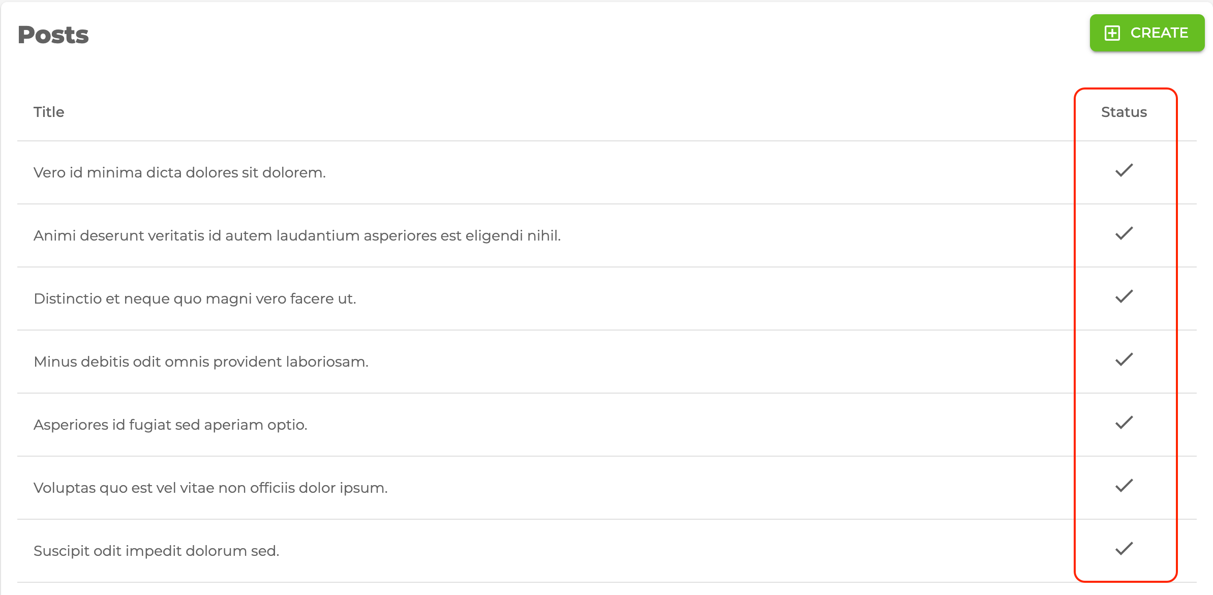
Let's see how we can use <BooleanField> with the example in the post list.
src/pages/posts/list.tsx
import { useTable } from "@pankod/refine-core";
import {
    Table,
    TableBody,
    TableCell,
    TableHead,
    TableRow,
    BooleanField,
    List,
} from "@pankod/refine-mui";
import { Check, Close } from "@mui/icons-material";

export const PostList: React.FC = () => {
    const { tableQueryResult } = useTable<IPost>({
        initialSorter: [
            {
                field: "id",
                order: "asc",
            },
        ],
    });

    const { data } = tableQueryResult;

    return (
        <List>
            <Table aria-label="simple table">
                <TableHead>
                    <TableRow>
                        <TableCell>Title</TableCell>
                        <TableCell align="center">Status</TableCell>
                    </TableRow>
                </TableHead>
                <TableBody>
                    {data?.data.map((row) => (
                        <TableRow key={row.id}>
                            <TableCell component="th" scope="row">
                                {row.title}
                            </TableCell>
                            <TableCell align="center">
                                <BooleanField
                                    value={row.status === "published"}
                                    trueIcon={<Check />}
                                    falseIcon={<Close />}
                                    valueLabelTrue="published"
                                    valueLabelFalse="unpublished"
                                />
                            </TableCell>
                        </TableRow>
                    ))}
                </TableBody>
            </Table>
        </List>
    );
};

export interface IPost {
    id: number;
    title: string;
    status: "published" | "draft" | "rejected";
}
API Reference
Properties
| Property | Description | Type | Default |
|---|---|---|---|
| value | Field value | unknown | |
| valueLabelTrue | If there is a value, this is the text to use | string | "true" |
| valueLabelFalse | If there no value, this is the text to use | string | "false" |
| trueIcon | If there is a value, this is the icon to use | React.FC | object | <CheckOutlined /> |
| falseIcon | If there no value, this is the icon to use. | React.FC | object | <CloseOutlined /> |
| svgIconProps | Allows to set icon props | SvgIconProps | |
| AbstractTooltipProps | Material UI Tooltip properties | AbstractTooltipProps |