Export
<ExportButton> is a Material UI <LoadingButton> with a default export icon and a default text with "Export". It only has presentational value.
Refer to the for more detailed information about useExport. →
Usage
Use it like any other Ant Design <Button>. You can use it with useExport:
/src/pages/posts/list.tsx
import { useExport, useTable } from "@pankod/refine-core";
import {
    ExportButton,
    List,
    Table,
    TableBody,
    TableCell,
    TableHead,
    TableRow,
} from "@pankod/refine-mui";

export const PostList: React.FC = () => {
    const { tableQueryResult } = useTable<IPost>();

    const { triggerExport, isLoading: exportLoading } = useExport<IPost>();

    return (
        <List
            cardHeaderProps={{
                action: (
                    <ExportButton
                        onClick={triggerExport}
                        loading={exportLoading}
                    />
                ),
            }}
        >
            <Table>
                <TableHead>
                    <TableRow>
                        <TableCell>ID</TableCell>
                        <TableCell>Title</TableCell>
                    </TableRow>
                </TableHead>
                <TableBody>
                    {tableQueryResult.data?.data.map((row) => (
                        <TableRow key={row.title}>
                            <TableCell>{row.id}</TableCell>
                            <TableCell component="th" scope="row">
                                {row.title}
                            </TableCell>
                        </TableRow>
                    ))}
                </TableBody>
            </Table>
        </List>
    );
};

interface IPost {
    id: number;
    title: string;
}
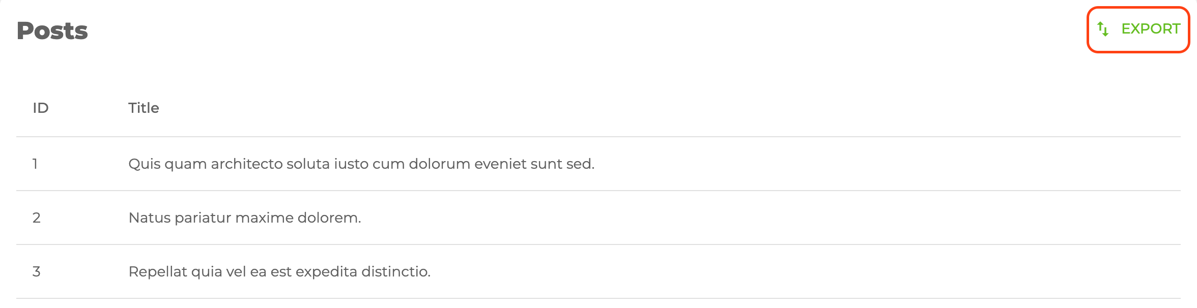
It looks like this:
Properties
hideText
It is used to show and not show the text of the button. When true, only the button icon is visible.
import { ExportButton } from "@pankod/refine-mui";

export const MyRefreshComponent = () => {
    return <ExportButton hideText />;
};
API Reference
Properties
| Property | Description | Type | Default |
|---|---|---|---|
| props | Material UI loading button properties | LoadingButtonProps | |
| hideText | Allows to hide button text | boolean | false |
| loading | Sets the loading status of the button | boolean | When the request is not completed, loading is true, when it completes it's false |
| children | Sets the button text | ReactNode | "Export" |
| startIcon | Sets the icon component of button | ReactNode | <ImportExportOutlinedIcon /> |
| svgIconProps | Allows to set icon props | SvgIconProps |